Overview
You can set dynamic values from URL parameters by setting them as arguments:
# test/components/previews/example_component_preview.rb
class ExampleComponentPreview < Lookbook::Preview
  def with_dynamic_title(title: "Example component default")
    render(ExampleComponent.new(title: title))
  end
end
And then supplying the values via URL parameters:
/lookbook/inspect/example/with_dynamic_title?title=Custom+title
However manually updating the URL is not very user-friendly or discoverable so Lookbook lets you configure editable preview parameters using the @param tag.
These generate form controls to allow param values to be changed on-the fly from right within the Lookbook UI, much like the Controls (knobs) addon for Storybook.
A basic example
Add a @param tag to tell Lookbook to generate a form field for a method argument:
class HeaderComponentPreview < ViewComponent::Preview
  # @param text
  def default(text: "Some header text")
    render Elements::HeaderComponent.new do
      text
    end
  end
end
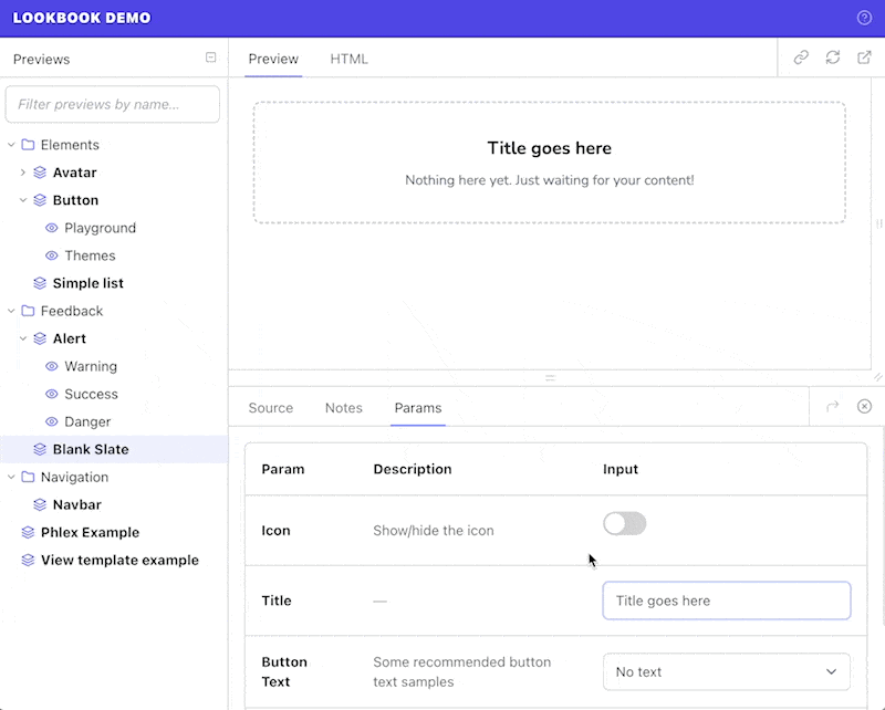
In ths example the editable text field will appear under the ‘Params’ tab in the preview inspector. Editing the text in this field will re-render the preview with the new content:
Param tag format
The @param tag takes the following format:
@param <name> <input_type> <description?> <opts?>
<name>
|
String
|
Name of the preview param (should match example method argument key) |
<input_type>
|
String
|
Input field type to generate in the UI |
<description>
|
String
|
Optional short description of what the param is used for, supplied as a double-quoted string. |
<opts?>
|
String
|
Optional hash of options for customising the field display. See the param options section for more info. |
class ButtonComponentPreview < ViewComponent::Preview
  # @param arrow toggle
  # @param theme select { choices: [primary, secondary, danger] }
  # @param content text "The text to display in the button"
  def default(content: 'Click me', theme: 'primary', arrow: true)
    render Elements::ButtonComponent.new(theme: theme, arrow: arrow) do
      content
    end
  end
end
Input types
The available input field types are listed below.
If you require a type of input that is not provided by Lookbook (or wish to override an existing one) then you can also add your own custom inputs quickly and easily.
Text-style inputs
Single line fields, useful for short strings of text or numbers.
@param <name> text
@param <name> email
@param <name> number
@param <name> url
@param <name> tel
@param <name> date
@param <name> datetime-local
Textarea
Multi-line textarea field for longer-form content.
@param <name> textarea
Select box
Dropdown select field for selecting from a list of known items.
@param <name> select <opts>
# Basic options:
# @param theme select { choices: [primary, secondary, danger] }

# With custom labels (each item itself an array of [label, value]):
# @param theme select { choices: [[Primary theme, primary], [Secondary theme, secondary], [Danger theme, danger]] }

# With empty option (`~` in YAML)
# @param theme select { choices: [~, primary, secondary, danger] }
Toggle
On/off switch for toggling boolean values.
@param <name> toggle
Color
Color picker input. Provides a six-letter hex code in the format #ff0000.
@param <name> color
Range
Range slider input. min, max and step values should be provided via the options hash.
@param <name> range { min: 0, max: 10, step: 1 }
Options
@param options provide a way to further customise the display of each field in the Lookbook UI.
See the options reference section for details of available options. Any ‘unknown’ options will be used to generate HTML attributes for the relevant input element.
Options can be provided inline (in YAML hash format), dynamically generated via a preview class instance method or evaluated Ruby statement, or loaded from a file.
# Inline:
# @param theme select { choices: [primary, secondary, danger] }

# Dynamic - method reference:
# @param theme select :name_of_method_that_returns_options

# Dynamic - evaluated Ruby statement:
# @param theme select {{ FooComponent::OPTIONS }}

# File:
# @param theme select ./path/to/options.yml
Note that the options hash, method or file reference should always be placed at the very end of the @param tag annotation.
Inline options
The simplest way to specify options for a param field is to hard-code it as a YAML-formatted hash. For example, as in the case for the list of select options in the example below:
# @param theme select { choices: [primary, secondary, danger] }
This is straightforward and useful for simple cases, but if you have a long list of choices or you want to reference values elsewhere to prevent duplication then hard-coding the data might not be the ideal solution
Dynamic options
For more flexibility it is possible to generate the options hash dynamically from Ruby code.
Using a method
You can use a private method (in your preview class) that returns a hash of param options, and reference it via its symbolized name:
# @param theme select :method_that_returns_options
Note that you cannot pass any arguments to the method.
class ButtonComponent::Preview < ViewComponent::Preview
  # @param theme select :theme_options
  def button(theme: :danger)
    # ...
  end

  private

  def theme_options
    {
      choices: %i[primary secondary danger],
      include_blank: true
    }
  end
end
Using a Ruby statement
For maximum flexibility it is also possible to evaluate arbitrary Ruby statements to generate the options.
The statement must be placed within double curly brackets and will be evaluated in the context of the current preview class, as with the method reference technique above.
# @param theme select {{ ButtonComponent::THEMES }}
File options
It is possible to import YAML/JSON data from a file by providing the file path:
# @param theme select data/theme-select-data.yml
# data/theme-select-data.yml
choices:
  - primary
  - secondary
  - danger
Files must have a .json or .yml extension, and by default paths are resolved relative to the application root directory.
However, if the path starts with ./ or ../ then the path will be resolved relative to the current preview file. For example:
# @param theme select ./theme-select-data.json
# @param theme select ../data/theme-select-data.json
Options reference
All of the below options are optional, although specific inputs may require or rely on additional options (such as the choices option for select inputs).
label
|
String
|
Custom label text |
description
|
String
|
Short description of what the param is used for. An alternative to providing the description in the main body of the annotation. |
hint
|
String
|
Help text. Displayed as a tooltip when hovering over a ‘?’ icon next to the label. |
Default values
Default values are specified as part of the preview example method parameters in the usual Ruby way:
def button(content: 'Click me', theme: 'primary', arrow: false)
  # ...
end
These will be used as the default values for the param fields.
Type casting values
Most dynamic param values are passed to the example method as strings, with the following exceptions:
toggleinput - values are cast to booleansnumberinput - values are cast to integers
In some cases, you may want to type cast the parameter value to something else (for example a Symbol) before using it when initializing the component.
To help with this, a type can be specified in the @param definition to automatically cast the dynamic value to a different type.
The type can either be provided in the body of the @param tag, surrounded by square brackets:
# @param <name> [<type>] <input_type> <opts?>
or as the value of the value_type key in the param options:
# @param <name> <input_type> { value_type: "<type>" }
Both examples below are equivalent, and the value of the theme param (by default a string) will be automatically cast to a Symbol, ready for use in instantiating the component.
# @param theme [Symbol] select { choices: [primary, secondary, danger] }
def default(theme: :primary)
  render Elements::ButtonComponent.new(theme: theme) do
    'Click me'
  end
end

# @param theme select { choices: [primary, secondary, danger], value_type: "Symbol" }
def default(theme: :primary)
  render Elements::ButtonComponent.new(theme: theme) do
    'Click me'
  end
end
The supported types to cast to are:
String- default for all excepttoggleinputsBoolean- default fortoggleinputsSymbolDateDateTimeIntegerFloat
The following structured types are also available but should be considered experimental - you may run into bugs!
Hash- value string converted to Hash using the Ruby YAML parserArray- value string converted to Array using the Ruby YAML parser