Overview
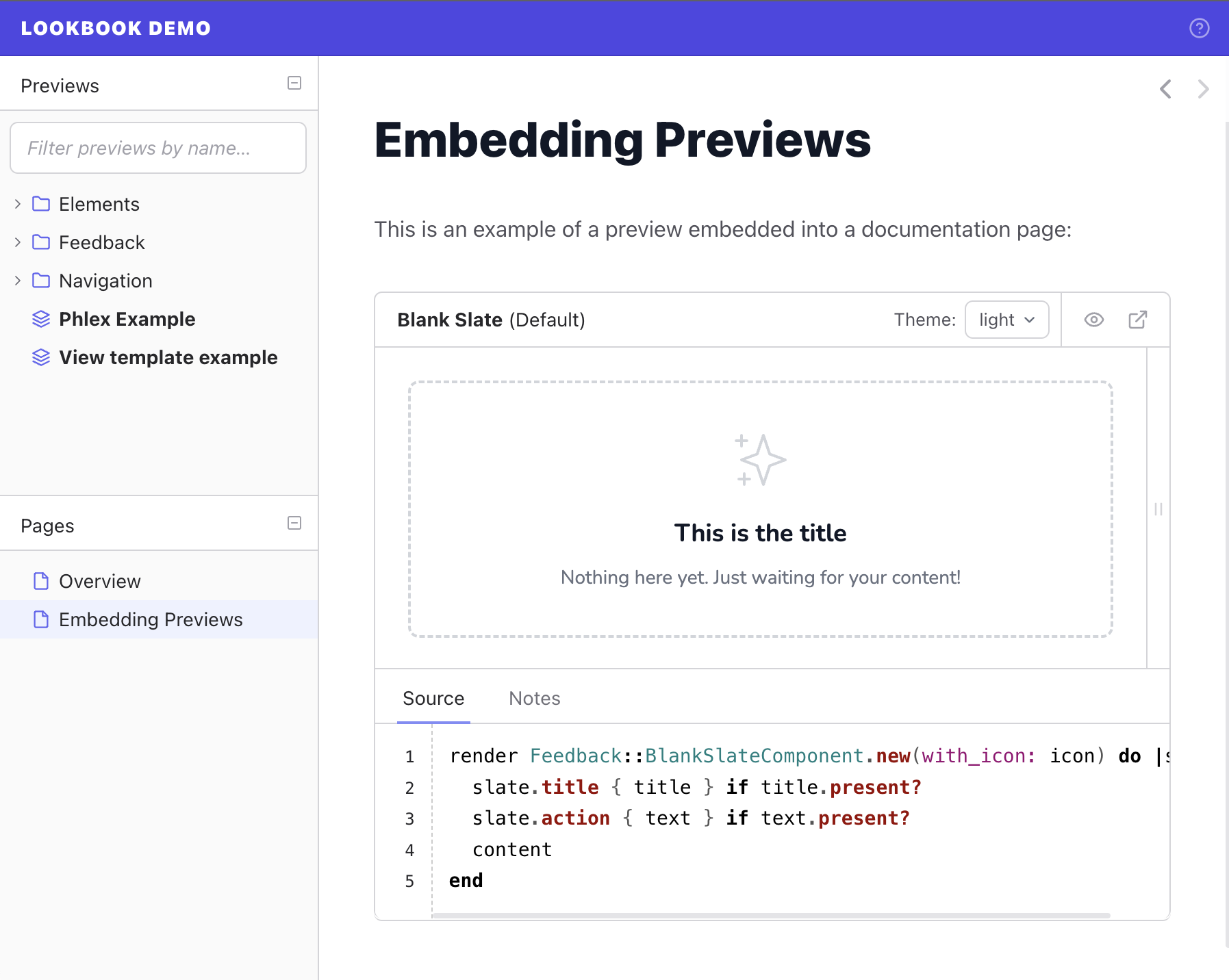
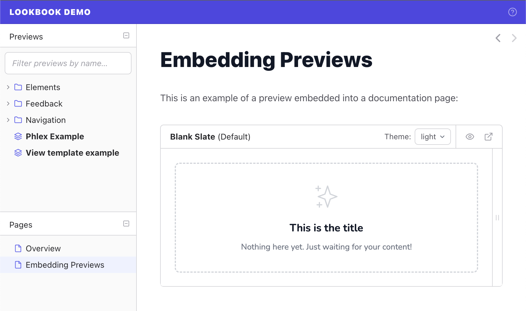
You can embed previews from your project directly into Lookbook content pages to help create living documents that always feature the latest changes to your component previews.
A basic preview embed within a documentation page looks like this:
Adding previews to pages
Preview embeds are added to pages using the <lookbook-embed> element.
Customisation options are set using attribute key/value pairs on the element:
<lookbook-embed
  preview="Feedback::BlankSlateComponentPreview"
  scenario="default"
  panels="params,source,output">
</lookbook-embed>
See preview embed configuration section to learn more about available customisation options.
Getting embed codes
The quickest way to get an embed code is to open the relevant preview in Lookbook and click on the ‘embed’ icon in the top right toolbar.
This will open a panel where you can see the embed code for the current preview. Just copy and paste the code from here into the desired page and the preview embed will be displayed.
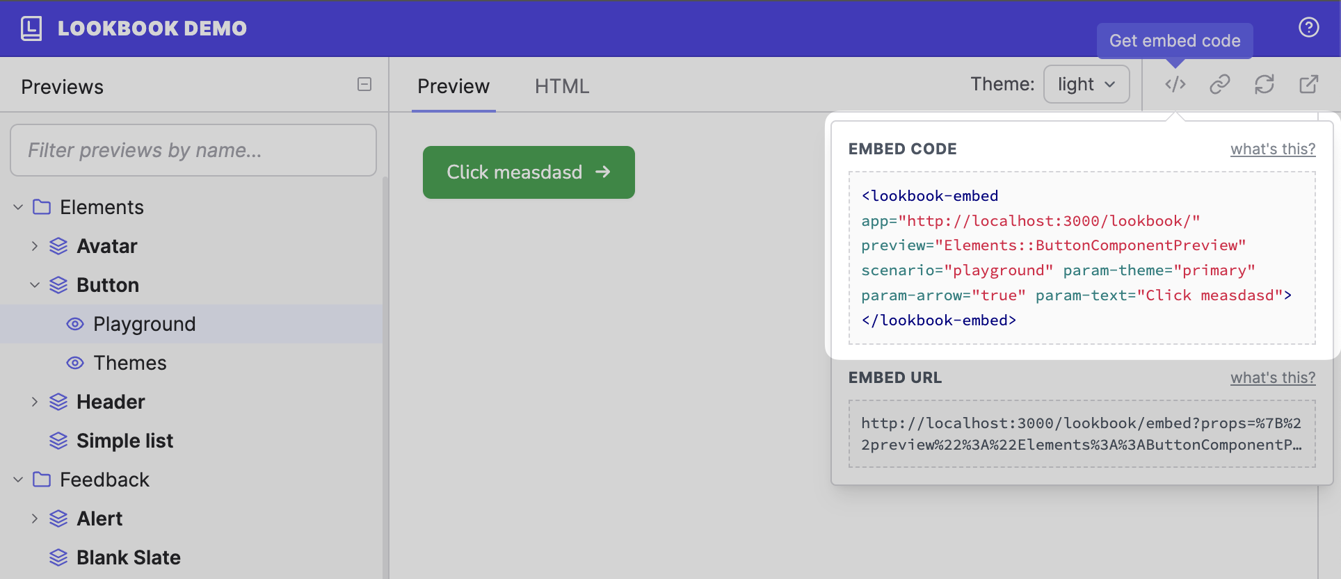
The embed code will automatically reflect any @param values that have been set - so the resulting embed will default to these values.
The `embed` helper
There is an embed helper method available to Lookbook content pages that can be used as an alternative to using embed codes directly.
The helper accepts a preview class and a method name (as a symbol) to determine what to render:
<%= embed Feedback::BlankSlateComponentPreview, :default %>
This will generate a preview for the default scenario of the Elements:ButtonComponentPreview preview class.
Preview params
If you have configured your scenarios to accept preview params, then you can supply values for those params when rendering the embedded preview:
<%= embed Feedback::BlankSlateComponentPreview, :default, params: {
  icon: "plus",
  text: "Add new"
} %>
Panels
Preview embeds can be configured to display one or more inspector panels.
The panels option accepts an array of panel names of the panels you wish to display for this embed:
<%= embed Feedback::BlankSlateComponentPreview, :default, panels: ["source", "notes"] %>
Available panels:
source
|
The source code for the current preview |
notes
|
Notes on the current preview |
params
|
Displays the dynamic param editor fields |
output
|
The rendered HTML output from the component |
Note that the wildcard character * can be used to represent ‘all other panels’.
["*"] <!-- show all panels, including any custom ones -->
["notes", "source", "*"] <!-- show notes, then source, then all other panels -->